Loading...

TL;DR:
- Using visuals like infographics and videos significantly boosts backlinks, engagement, and search rankings.
- Strategic placement and authentic visuals build trust, improve user experience, and maximize SEO benefits.
- A hybrid approach combining infographics, videos, and custom images leads to the best content performance.
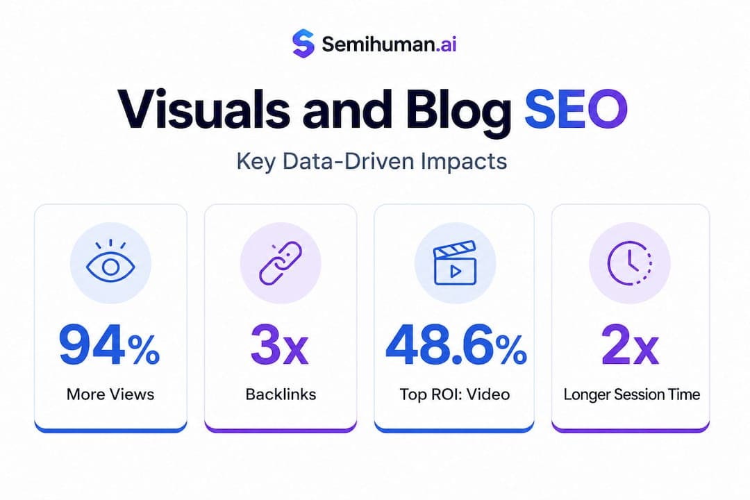
Blog posts with infographics earn 178% more backlinks than those without — and yet most bloggers still treat visuals as decoration rather than strategy. That gap is costing you traffic, rankings, and reader loyalty. The way you integrate images, infographics, and video into your content directly shapes how search engines score your pages and how long readers actually stay. This guide breaks down which visuals work, why they work, and exactly how to deploy them so every image in your post is pulling its weight.
| Point | Details |
|---|---|
| Visuals boost backlinks | Infographics and visual content dramatically increase quality backlinks for better SEO. |
| Hybrid formats win | Posts combining infographics, images, and short-form video claim the highest engagement and ROI. |
| Placement matters | Strategic placement and integration of visuals above the fold and near key text maximizes value. |
| Authenticity builds trust | Using authentic, minimally edited visuals maintains brand credibility and deepens audience trust. |
Most content creators understand, at a gut level, that visuals make posts more readable. What fewer people realize is how deeply visuals affect the technical signals that search engines use to rank your content. Time on page, scroll depth, bounce rate, and backlink acquisition are all measurable outcomes that improve when visuals are used intentionally. These are not soft, anecdotal benefits. They are concrete ranking factors.
"A post that holds a reader's attention for four minutes instead of ninety seconds sends a clear signal to Google: this content is valuable. Visuals are the primary driver of that extended engagement."
When you look at the data across visuals versus text performance in content marketing, the gap is striking. Static text posts may convert and inform, but they rarely attract the organic link equity that infographics and mixed-media posts generate naturally.
Here is what the research tells us about the specific impact of visuals:
Understanding these benefits changes how you think about visual elements in blog content. It shifts the mindset from "what image looks nice here" to "what visual will drive the most measurable outcome for this specific post." That is a critical distinction, and the rest of this guide is built around it.
Not all visuals serve the same purpose. An infographic packed with verified statistics does something entirely different from a short product demo video or a branded hero image at the top of your post. The mistake most bloggers make is using whatever visual feels easiest rather than choosing the format that best matches the post's goal.
Start by identifying what you want the post to accomplish. Are you trying to earn backlinks and establish authority? Are you explaining a complex process? Are you inspiring someone to take an action? Each goal maps to a different visual type.
Here is a practical comparison of the most common visual formats:
| Visual type | Best use case | SEO benefit | Engagement strength |
|---|---|---|---|
| Infographic | Data, statistics, comparisons | Very high (backlinks) | High (shareability) |
| Short-form video | Tutorials, demos, storytelling | High (time on page) | Very high (ROI) |
| Custom photography | Branding, authenticity | Moderate | High (trust) |
| Screenshots | How-tos, software guides | Moderate | High (clarity) |
| Interactive charts | Research, data journalism | High (dwell time) | Very high (engagement) |
| Stock images | Filler, section breaks | Low | Low |
The table above makes one thing very clear: generic stock images are the weakest investment of your time and budget. They add visual texture, but they rarely drive meaningful SEO or engagement results. If your post relies heavily on stock photography, that is a signal worth addressing.
Short-form video now leads all content formats in ROI, with 48.6% of marketers citing it as their top performing format. Embedding even a 60-second explainer or summary video into your blog post can significantly improve watch time, session duration, and conversion rates. It also gives your post a second life on video platforms.
Infographics remain the gold standard for visual storytelling trends in SEO-focused content. However, they only earn links if the data behind them is verifiable. Infographics require verifiable data, source citations, and an embed code to maximize shareability. Without those elements, other site owners have no reason to embed or link to your graphic.
Here is how to choose your visual format based on content goal:
Pro Tip: Always add an embed code beneath any data-driven infographic you publish. This one step dramatically increases the probability that other bloggers will share your graphic with a backlink attached.
Hybrid posts that combine a lead infographic, embedded short-form video, and supporting custom images consistently outperform single-format posts across both SEO and engagement metrics. The combination works because different readers consume content differently: some scan visuals, some watch video, some read every word. Meeting all three groups in a single post expands your reach without creating additional content.
Choosing the right visual is only half the equation. Where and how you place it inside the post determines whether it reinforces your message or simply occupies space. Poor placement can actually hurt engagement by breaking the reader's flow at the wrong moment or front-loading the page in a way that slows load times.

Strategic placement above the fold, near relevant text, with descriptive captions and internal links, is the approach that consistently maximizes both SEO impact and user guidance. "Above the fold" means the visual appears without the reader needing to scroll. This is where first impressions form, and a strong hero image or infographic here signals immediately that the post has depth and substance.
Here is a breakdown of optimal placement by visual type:
| Placement position | Best visual type | Primary benefit |
|---|---|---|
| Above the fold (hero) | Infographic or custom image | Immediate engagement, low bounce rate |
| After intro paragraph | Summary chart or data visual | Context for the argument to follow |
| Mid-article beside text | Screenshots or diagrams | Clarifies complex points in real time |
| End of major section | Video embed | Deepens engagement before next scroll |
| Near the CTA | Before-and-after or comparison | Supports conversion |
Additional placement principles that directly affect performance:
Pro Tip: Avoid visual clutter. The rule is simple: if an image does not clarify, support, or enhance the specific paragraph it appears beside, cut it. Every image that makes a reader pause without purpose costs you attention and trust.
Frequency matters too. The data and digital marketing content best practices consistently point to one image per 400 to 600 words as the optimal ratio. This gives readers visual breathing room without making the post feel sparse or underdeveloped.
There is a quiet but serious problem in blog content right now: over-edited, generic, or mismatched visuals that undermine the credibility of otherwise strong writing. Readers are more visually literate than ever. They can tell when an image feels staged, when a stock photo has no connection to the article's actual subject, or when an infographic was thrown together without real data behind it.
"The image you choose is a trust signal. If it feels fake, filtered, or disconnected from your message, readers will extend that skepticism to your entire post."
Overprocessing images harms trust and engagement. The research is clear on this: restrained edits, natural color tones, moderate contrast, and authentic skin tones preserve the credibility that heavy filters destroy. This applies to every image in your post, not just hero photography.
Here are the authenticity principles every content creator should apply:
Building authentic blog content naturally means treating every visual as part of your editorial voice, not just an accessory. The most trusted blogs in any niche share a common trait: their visuals feel like they belong in the post, not like they were added to break up text.
Here is the view that most SEO guides will not share with you: the old model of "just add more images" is no longer sufficient, but the new obsession with short-form video as a silver bullet is equally incomplete.
The blogs that consistently outperform their competitors in 2026 are not the ones that went all-in on video or doubled down on infographic production alone. They are the ones that built intentional hybrid visual systems, combining the link-building strength of data infographics with the engagement depth of short-form video and the brand trust of consistent custom photography.
Short-form video dominates engagement ROI across the board, but video without supporting written and visual context rarely converts. Readers who land on a blog post from a search result are in an active information-seeking mode. A 90-second video might delight them, but a well-structured infographic that answers their exact question will keep them on your page and push them deeper into your content funnel.
The risk in chasing every emerging visual trend is real. Interactive maps, 3D graphics, and motion-heavy layouts can slow load times, confuse navigation, and distract from your actual message. The brands that win are the ones that add new formats selectively, testing each against their specific audience's behavior rather than adopting them wholesale because a marketing report said they are popular.
What we recommend at Semihuman.ai is a principle we call "format discipline": know exactly why each visual format is in your post before you publish. If you cannot articulate the specific SEO or engagement outcome a visual is meant to drive, replace it with something that can. This applies whether you are writing with AI assistance or entirely by hand. AI-powered visuals in blogs are increasingly accessible, but the strategy behind them still requires human judgment.
The best performing posts in 2026 lead with an infographic for link acquisition, embed a short video for retention, and use custom or minimally edited photography to reinforce brand trust. That combination is not flashy. It is disciplined. And discipline, in visual content strategy as in most things, is what actually compounds over time.
You now have the framework for using visuals that earn backlinks, extend session time, and build trust with every reader who lands on your posts. The next step is executing that strategy efficiently, especially when you are producing content at scale.

Semihuman.ai's SEO text generator helps you build blog posts with smart visual cue placements, keyword-rich captions, and structured image integration baked directly into the content flow. You get posts that are already optimized for where visuals belong, not posts you have to retrofit after writing. And because Semihuman.ai is built to bypass AI detectors while maintaining authentic, human-quality output, your visual-rich posts will read naturally to both search engines and real readers. If your goal is content that performs rather than just content that exists, Semihuman.ai is built for exactly that.
Aim for one image or visual for every 400 to 600 words, which keeps engagement high without creating clutter that distracts from your message.
Place key visuals above the fold and directly beside explanatory text, using descriptive captions and internal links, since above-the-fold placement maximizes both user guidance and search engine signals.
Infographics with verifiable data and embed codes earn the most backlinks, because data-backed infographics give other publishers a specific, credible resource worth referencing and sharing.
Short-form video leads all formats in marketing ROI, with 48.6% of marketers ranking it as their top performing format for engagement and measurable return.


Start
Humanizing
for Free!
Humanize