Loading...

Most content creators assume that showing data is enough to convince an audience. It isn't. Research consistently shows that raw numbers without context fail to move people to action, and that audiences forget isolated statistics almost immediately. Data-driven storytelling changes that equation by weaving credible data, clear narrative, and purposeful visuals into a single, coherent message. Whether you're a marketer building a campaign case, an academic presenting research, or a creator trying to grow an engaged audience, this guide covers what data-driven storytelling actually is, its core elements, how to structure it, what mistakes to avoid, and how to apply it right now.
| Point | Details |
|---|---|
| Data alone isn’t enough | Combining accurate data with targeted narrative and visuals delivers real audience impact. |
| Simplicity wins in visuals | Simple chart types and decluttered graphics are most effective for communication. |
| Audience-first is critical | The best data stories start with audience needs, not with the data itself. |
| Watch for bias and errors | Protect trust and authenticity by avoiding cherry-picking and narrative bias. |
| AI tools can amplify results | Technology solutions help integrate, optimize, and scale data-driven storytelling. |
At its core, data-driven storytelling is not just putting a chart next to a paragraph. It is the deliberate integration of credible data, narrative arc, and visual communication to produce insights that audiences can understand and act on. As OWOX describes it, "data-driven storytelling combines data, visuals, and narrative to translate insights into compelling stories that drive action and understanding." That three-part combination is what separates a forgettable report from a story people remember and share.
Why does this matter? Because data alone rarely persuades. Studies on cognitive processing show that people understand and retain narrative-wrapped information far better than raw figures. A table of churn rates means little. A story about why a specific customer segment left, backed by that same data, creates understanding and urgency.
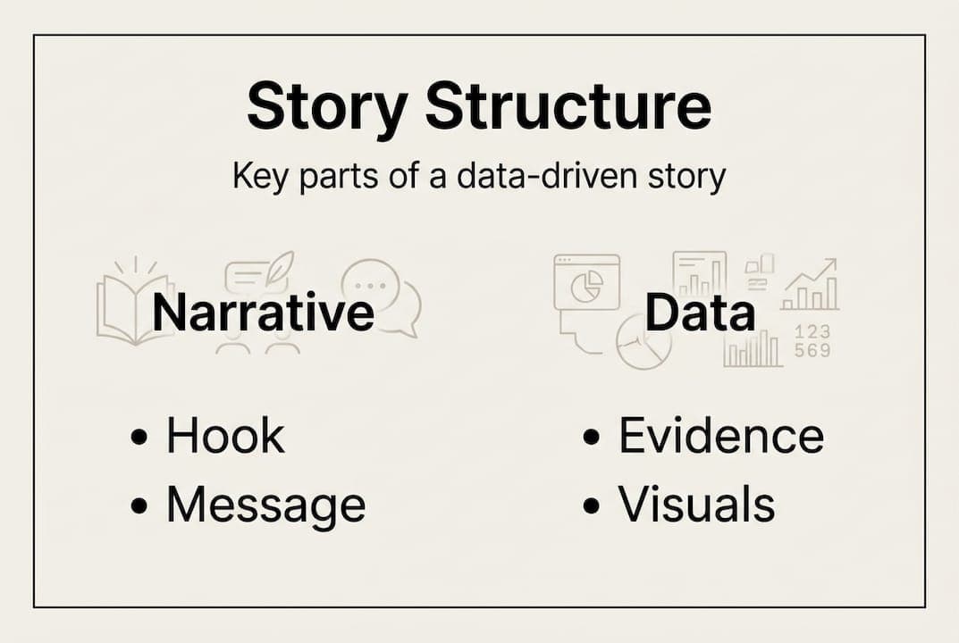
The structure of a data-driven story follows a recognizable arc:
"Beginning (hook/problem), Middle (investigation/methodology), Ending (recommendation/action)." This Brent Dykes framework gives every data story a spine that guides the audience from confusion to clarity.
This structure matters because it mirrors how humans naturally process information. We need a reason to care (the hook), evidence to trust (the investigation), and a clear path forward (the action).
Data-driven storytelling is also growing fast as a practice. Content creators and marketers now use it to justify budgets, explain campaign results, and pitch new strategies. The rise of machine learning in content marketing has made it easier to surface meaningful patterns in large datasets, but the storytelling layer still requires human judgment. Tools that support data-driven content optimization can help identify what resonates, but shaping that into a narrative is a skill worth building deliberately.
One common misconception is that data-driven storytelling means decorating a dashboard with words. It doesn't. The data serves the story, not the other way around. You select data because it answers a specific audience question, not because it looks impressive. That shift in mindset, from showcasing data to clarifying it, is what makes a story genuinely useful. Maintaining authenticity in AI content follows the same logic: the goal is always to serve the reader, not to perform expertise.
Every effective data-driven story shares a set of building blocks. Dataquest identifies key components as accurate data, compelling narrative, effective visualizations, audience targeting, and actionable insights. Brent Dykes expands this into six distinct elements: a data foundation, a clear main point, an explanatory focus, a linear sequence, dramatic elements, and visual anchors.

Here's how those two frameworks compare:
| Element | Dataquest | Brent Dykes |
|---|---|---|
| Trustworthy data | Accurate data | Data foundation |
| Clear message | Actionable insights | Main point |
| Story structure | Compelling narrative | Linear sequence + dramatic elements |
| Visuals | Effective visualizations | Visual anchors |
| Audience fit | Audience targeting | Explanatory focus |
The overlap is reassuring: both frameworks agree that data quality, narrative clarity, and audience relevance are non-negotiable. Where Dykes adds value is in the emphasis on drama, meaning tension, stakes, and resolution. Without those, even accurate, well-visualized stories feel flat.
Here's a practical sequence for building your own data story:
Pro Tip: Before finalizing your story, ask yourself: "If I removed this data point, would the story still make sense?" If yes, cut it. Audience attention is limited, and every extra number you add dilutes the impact of the ones that matter.
Simple visuals consistently outperform complex ones. A clean bar chart beats a multi-layered scatter plot for most audiences. Clarity is not a design preference; it's a communication strategy. Examples of humanized content show that the same principle applies to writing: strip away complexity, and the real message lands harder. Humanizing content marketing starts with respecting your audience's time and cognitive load.
Structure and visualization are where most data stories either succeed or fall apart. The practical process starts before you open any design tool.
Begin with the audience's core need or problem as your hook. What question keeps them up at night? What decision are they trying to make? Your opening should make them feel seen, not impressed. From there, build through evidence: present your methodology, show the data, and explain what it means. Close with a clear recommendation or action step.
For visuals, choosing the right chart type is as important as choosing the right data. Here's a quick reference:
| Chart type | Best use case |
|---|---|
| Bar chart | Comparing categories or groups |
| Line graph | Showing trends over time |
| Scatter plot | Revealing correlations between variables |
| Pie chart | Showing parts of a whole (use sparingly) |
| Heat map | Displaying intensity across two dimensions |
Cole Nussbaumer Knaflic consistently emphasizes putting audience consideration first, favoring simple visuals like bars and lines, and ruthlessly decluttering charts. Remove gridlines you don't need, eliminate dual axes whenever possible, and cut any visual element that doesn't carry information.
An empirical study of 103 participants found that data stories improve the efficiency of comprehension tasks compared to standalone visualizations. That's a meaningful finding: your audience isn't just more engaged, they actually understand faster.
Pro Tip: Use color intentionally. Highlight only the data point you want the audience to notice, and keep everything else gray or muted. This creates a natural focal point without requiring any explanation.
Bullet points for structuring your visualization process:
For deeper guidance on visual storytelling trends and how visuals in marketing compare to text-only content, the principles here scale across formats.
A powerful story built on shaky or selectively chosen data doesn't just fail; it damages trust. The dangers here are real and common.
The most frequent problem is cherry-picking: selecting only the data that supports a predetermined conclusion and ignoring contradictory evidence. This is sometimes intentional, but it often happens unconsciously because we fall in love with our own narrative. Misleading data stories most commonly result from cherry-picking, narrative bias, and selective omission.
Bias types to watch for:
"Stories beat raw charts for decisions, but narrative can sometimes fail to boost engagement when the audience doesn't connect with the framing." This tension from content marketing research is worth sitting with. Storytelling is a powerful tool, but it is not a magic fix for weak data or a disengaged audience.
Data integrity is the foundation. A story is only as credible as its evidence. If your data source is unreliable, outdated, or too small a sample to generalize from, no amount of narrative polish will save it. Audiences, especially sophisticated ones, will notice.
Pro Tip: Pressure-test your story by actively trying to disprove it. Ask: "What data would contradict this conclusion?" If you can't answer that question, you haven't thought critically enough about your evidence.
For marketers tracking performance, understanding content metrics helps you distinguish between stories that genuinely resonate and ones that only appear to based on vanity metrics.
Here's something most guides won't tell you: the biggest mistake in data-driven storytelling isn't a bad chart or a weak dataset. It's starting with the data instead of starting with the audience.
We've seen this pattern repeatedly. A marketer spends hours building a beautifully structured story loaded with statistics, only to watch it land flat because it answered a question nobody was actually asking. The data was accurate. The visuals were clean. But the story was built for the analyst, not the audience.
Great stories start and end with what the audience cares about. As Dataquest emphasizes, prioritizing audience needs over comprehensive data dumps is what actually enhances engagement and authenticity. Personalized, relevant content consistently beats exhaustive but unfocused stories.
The uncomfortable truth is that more data often makes a story worse, not better. Every additional data point you include is a decision you're making for your audience: "I think this is worth your attention." Most of the time, that decision is wrong. Strip your story down to the single most important insight, and build everything else around supporting that one point.
Pro Tip: Test your draft on someone completely unfamiliar with your project. Don't explain anything. Just ask: "What's the main takeaway?" If they can't tell you in one sentence, the story needs more work, not more data. Exploring content personalization trends can give you sharper tools for understanding what your specific audience actually needs to hear.
Armed with new strategies and pitfalls to avoid, the right technology partner can make execution significantly faster and more consistent.

Semihuman.ai is built for exactly this kind of work. When you're combining data, narrative, and visuals into content that needs to feel genuinely human and perform well in search, our platform helps you get there without sacrificing authenticity. Use the SEO text generator to amplify your content's reach while keeping the narrative tight. Leverage AI proof writing to sharpen clarity and originality across every draft. And when you need to rework phrasing without losing your core message, the AI text paraphraser handles it cleanly. Data-driven storytelling at scale starts here.
Start by understanding your audience's needs and the specific question they want answered, then select only the data that directly supports your story. Audience needs should always come before data selection, not after.
Bar charts and line graphs handle most use cases clearly and keep audience attention on the insight rather than the chart mechanics. Simple visuals almost always outperform complex ones for comprehension.
Verify your data sources, avoid selecting only the facts that confirm your hypothesis, and actively look for evidence that could contradict your conclusion. Narrative bias and cherry-picking are the two most common ways data stories mislead unintentionally.
Yes, particularly for audiences who aren't already fluent in reading standard visualizations. An empirical study of 103 participants confirmed that data stories improve the efficiency of comprehension tasks compared to charts alone.


Start
Humanizing
for Free!
Humanize